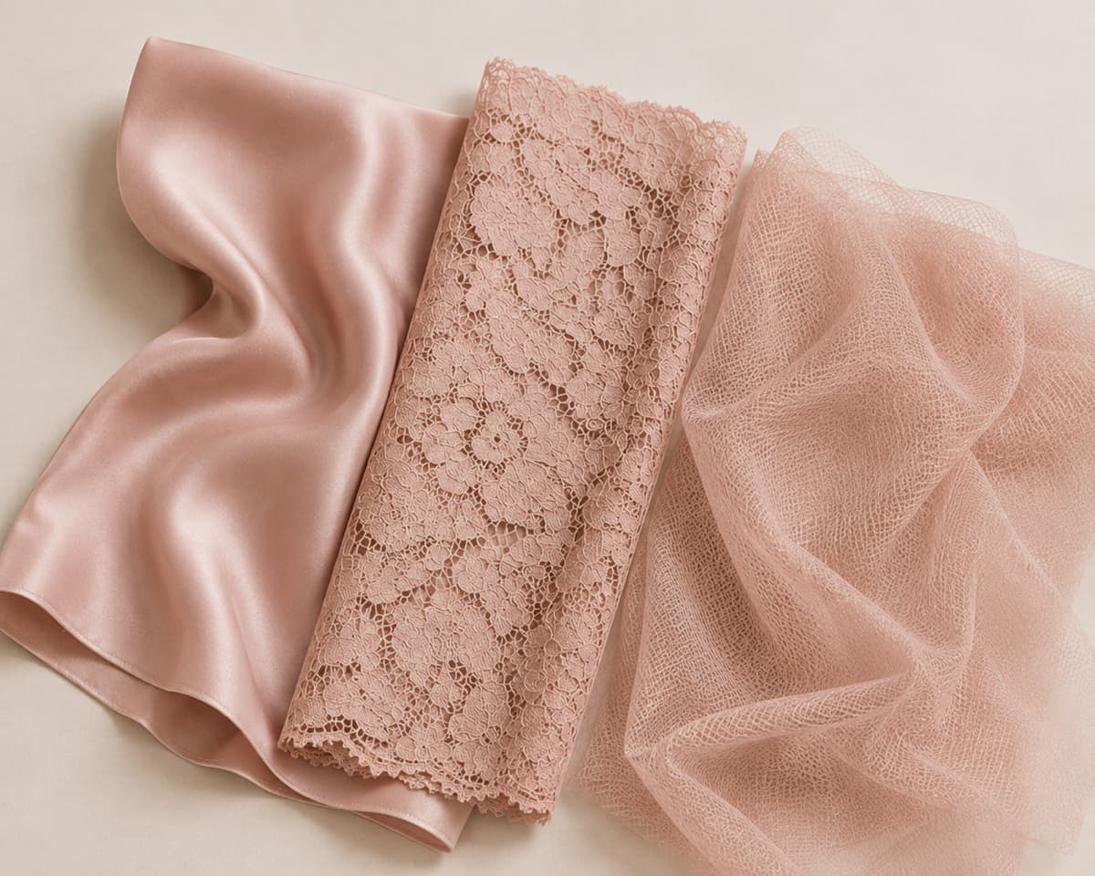
Designing with multiple fabrics can look incredible on paper. Silk body, lace trim, mesh inserts — the combination adds depth and gives a garment that layered, premium feel. And visually, it really can work.
But here’s something that tends to catch designers off guard once sampling starts: the same colour rarely looks the same across different materials.
Even when each fabric is dyed to an identical colour specification, silk, lace and mesh each absorb dye differently. The fibre composition, surface texture, and fabric structure all react in their own way, so the result is never identical. Specify a Pantone or LAB value and everyone will dye to it. What actually lands on the fabric is still up to the material itself.
And some colours make this harder than others. White, black and deeper tones are generally easier to control across fabrics. But softer shades like skin tones, warm greys, mauves and custom-developed pastels can become a real headache when multiple fabric types are involved. The closer you need the colours to match, the more difficult and costly the process gets.
The variation is easier to work with than to fight.
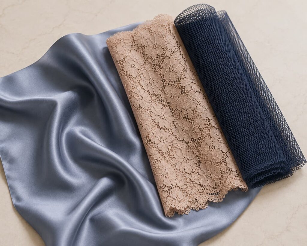
When you’re working with stock fabrics in standard available colours, the optimal starting point for the honest approach is to design for contrast rather than expecting laboratory-perfect matching between completely different materials. A slight variation between silk and lace isn’t a flaw if you’ve anticipated it. It can actually add dimension. The fabrics photograph differently, they catch light differently, and that’s often what makes a garment feel interesting rather than flat.
Where things go sideways is when a design relies on three or four fabrics reading as the exact same shade. That’s a difficult ask in production, and it tends to generate a lot of back-and-forth during development.
More fabrics also means more of everything else.
There’s a production side to this that’s easy to underestimate, especially at smaller quantities.
Every additional fabric brings another supplier, another dye lot, another MOQ, another development step, and another potential point of delay or mismatch. For larger brands ordering thousands of pieces, this is manageable. For smaller runs, it can push sampling and production costs up faster than expected, and a correction round on colour is never cheap.
That’s not an argument for always keeping things simple. Sometimes the most considered designs are also the most restrained ones. Knowing where complexity earns its place, and where it just creates risk, is part of good product development.
Before adding another lace panel or contrast insert, it’s worth asking: does this genuinely improve the garment? Or does it mostly make production harder? Because great product development isn’t just about how something looks. It’s about what it actually costs to make it well.